If you’re a beginner, optimizing images for WordPress or any other platform will seem frustrating and complicated until you get the hang of it. It can be a bit tedious afterward, too, because you have to do several things manually that take some time if you’re working with a lot of images.
Some plugins can help you out and speed up the process, but I always recommend doing things manually if possible, to have fewer plugins. Plugins can create bloat, affect performance, create conflicts, contain bugs or security issues. So, it’s best to have as few as possible.
Therefore, in this detailed guide, I’ll show you how to optimize images for WordPress without a plugin.
Why Is It Important to Optimize Images for WordPress?
Optimizing images for your WordPress website is very important because:
- It improves your website’s performance and loading time – The smaller the file size, the less it will take the browser to download and display the image.
- It improves SEO (Search Engine Optimization) – Search engines, such as Google, favor websites that are optimized and fast because they deliver a better user experience.
- You save bandwidth and storage space – Some web hosts and other website tools offer low storage space and/or bandwidth. If you don’t optimize the images for your WordPress website, you’ll burn through those resources a lot faster. Thus, you’ll have to upgrade your package and pay more money.
Looking for an All-in-One WordPress Solution?
ReadyShip offers you ready-made WordPress sites and blogs, plus high-quality managed AWS hosting with free SSL and CDN, at no initial cost!
Choose the Correct Image File Format
It’s important to save the images in the correct file format. Otherwise, the file size can increase by a lot. You might have noticed by now that images have different file formats, the most common being the following:
PNG (.png)
This file format is used for simple images that contain text, icons, illustrations, etc. It’s a format that’s based on 256 colors, not millions.
Let’s take the following illustration of a dog as an example.
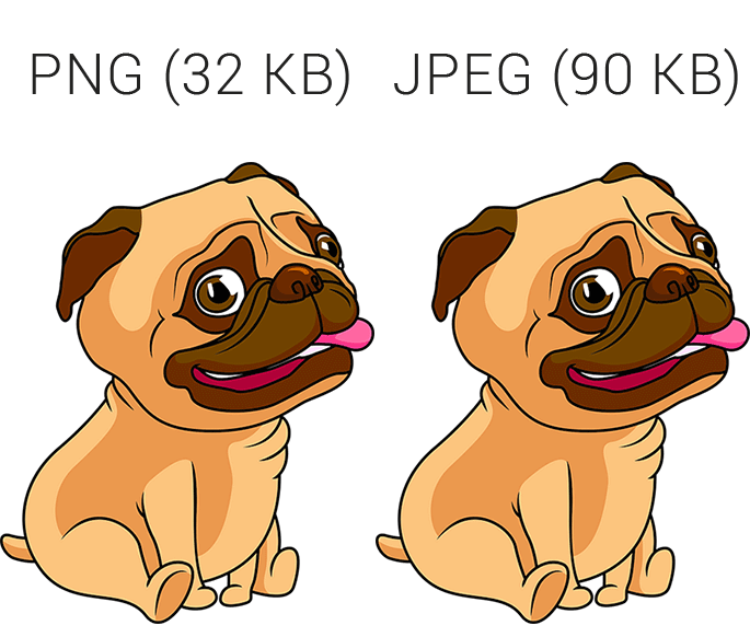
If I save it as a PNG, the image file only has 32 KB (Kilobytes). If I save it as JPEG or JPG, it’s almost three times the size.
Oh, and PNGs can have a transparent background, while JPEGs can’t.
PNG-8 and PNG-24
Depending on what tool you use to optimize images for WordPress, you might have to choose between PNG-8 and PNG-24.
- PNG-8 relies on 256 colors, which is enough for the types of images mentioned above.
- PNG-24 is the PNG variant for complex images, such as photos. It can be a substitute for the JPEG file format, but not a good one because it can create bigger file sizes.
So, don’t use the PNG-24 variant, not even for photos. Only use PNG-8 for the types of images mentioned above.
JPEG (.jpeg) or JPG (.jpg)
JPEG and JPG are the same things. But, JPG is the more common file extension.
The JPEG format is used for complex images with a huge amount of colors, such as photos. Let’s take the following image as an example.
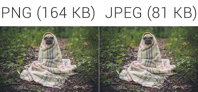
If I save the image as PNG, the file size would have 164 KB. On the other hand, the JPEG format will only have 81 KB.
WebP (.webp)
WebP is an image file format created by Google in 2010.
You might not have seen it often until recently because Apple didn’t support it on their Safari browser, which is largely used by Mac and iPhone users.
Those who wanted to use this file format on their websites needed to implement some workarounds, such as serving the WebP format only if Safari was detected. For many, the hassle wasn’t worth it, though.
That has changed now because the WebP format is finally supported starting with Safari 14. So, you can now use it without fear and hassle because it’s supported by all the major browsers.
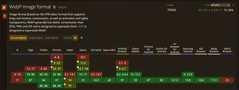
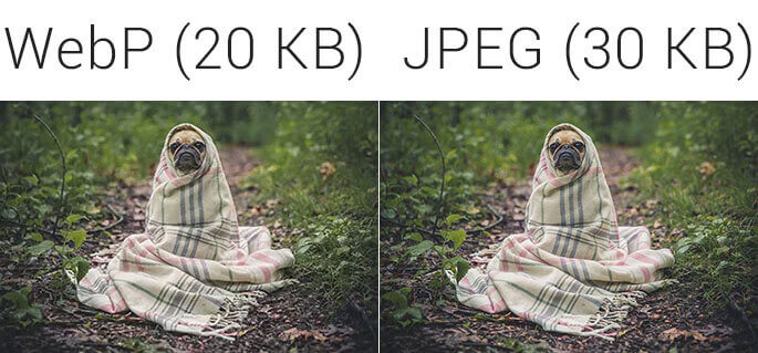
WebP can be used as a substitute for both PNG and JPEG. And I recommend that you use it as your main image format because the file size is up to 26% smaller compared to PNG, and up to 34% compared to JPEG.
But not everything is peachy with WebP yet.
WebP might generate bigger file sizes
As Google developers mention, in some cases, WebP images might end up being larger than PNGs or JPEGs. I noticed this in my case because I always scale down images to the proper sizes. Whenever I scale down a PNG image, the file size becomes bigger if I try to save it as WebP. It’s most likely because the pixels rearrange themselves and stuff like that. I don’t know the correct technical answer, though.
So, always check to see if the resulting WebP file size is bigger than the PNG or JPEG. If it is, you’ll be better off not using it.
WebP isn’t supported in WordPress by default
If you try to upload a WebP image format in WordPress, it will throw an error. So, you’ll have to enable it first. There’s a plugin that can do this, but you could also use this code snippet in your child theme’s functions.php file:
// Enable WebP in WordPress
add_filter( 'wp_check_filetype_and_ext', 'wpse_file_and_ext_webp', 10, 4 );
function wpse_file_and_ext_webp( $types, $file, $filename, $mimes ) {
    if ( false !== strpos( $filename, '.webp' ) ) {
        $types['ext'] = 'webp';
        $types['type'] = 'image/webp';
    }

    return $types;
}

add_filter( 'upload_mimes', 'wpse_mime_types_webp' );
function wpse_mime_types_webp( $mimes ) {
    $mimes['webp'] = 'image/webp';

  return $mimes;
}
Here’s how to access and edit your WordPress files.
WebP isn’t supported in Photoshop by default
If you use Photoshop, you’ll notice that it doesn’t have native support for WebP. Luckily, there’s a plugin made by those who handle the WebP project.
I wrote a tutorial on how to open and save WebP images in Photoshop using the plugin.
SVG (.svg)
SVG stands for Scalable Vector Graphics. Being vector-based means that the images don’t get blurry/pixelated when they’re enlarged in the browser. Pixel-based images, such as PNG or JPEG, get blurry when enlarged.
SVGs are not your ordinary image files. They are actually made out of XML code, which appears in the source code of your WordPress website.
For example, the code in the image will display the logo for the Facebook Messenger app.
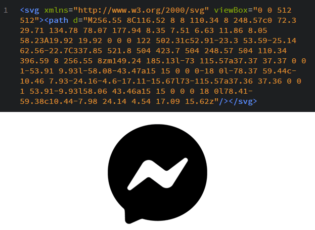
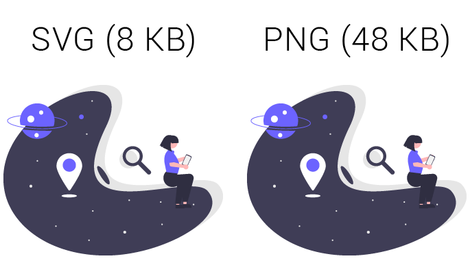
SVGs are used for simple images, such as illustrations, icons, logos. They should be used instead of PNG images when appropriate because they are made out of code and are vector-based.
Also, if they are used inside an external file (e.g. my-logo.svg), you’ll notice that the file size is usually a lot smaller compared to a PNG.
SVGs are not supported in WordPress by default
Because SVGs are made out of code, they can be injected with malware. So, WordPress doesn’t support the format by default, but you can enable it by installing a plugin called Safe SVG plugin. This plugin will also sanitize the SVG files on upload to get rid of any potential malware code.
GIF (.gif)
GIFs are animated images. I won’t talk much about them because they’re not used much, except when showing funny stuff. And even then, you should embed them from Giphy or something like that because they have very big file sizes.
In case you need animated images for your tutorials, I recommend using small MP4 (.mp4) videos instead of GIFs. The file size is smaller.
Summary of when and what image format to use
If your head is spinning by now with all those formats, then let me provide a brief explanation.
- WebP – Use it for simple images (e.g. illustrations, icons, logos) and photos, instead of PNG and JPEG, if the file size doesn’t become bigger.
- PNG (PNG-8 variant with 256 colors) – If WebP increases the file size, use PNG for simple images, such as text, illustrations, icons.
- JPEG/JPG – If WebP increases the file size, use JPEG for complex images with a ton of colors, such as photos.
- SVG – Whenever possible and appropriate, use it instead of PNG for icons, illustrations, logos.
Bottom line, it would be ideal to only use SVG and WebP, but that’s not possible all the time. When it’s not possible, use JPEG and PNG instead.
Looking for an All-in-One WordPress Solution?
ReadyShip offers you ready-made WordPress sites and blogs, plus high-quality managed AWS hosting with free SSL and CDN, at no initial cost!
Find the Proper Dimensions for Your WordPress Images
Finding out the proper image dimensions is another important part of image optimization for WordPress. Bigger dimensions result in bigger file sizes, which results in a heavier web page, which results in slower loading times.
Unnecessarily uploading bigger images might also trigger warnings, such as Serve Scaled Images, in some speed tools, even though WordPress should, theoretically, handle this.
The dimensions depend on the WordPress theme and design. There’s no one-size-fits-all solution. Some WordPress themes come with recommended dimensions in their documentation, but they don’t cover everything.
For example, if you’ll use a page builder to create your WordPress website, then you’ll have all sorts of columns with different dimensions.
Container width
By “container”, I mean the designated space in your layout where the content appears. It could be a column, the full width of your page, and so on.
I’m only focusing on width because the height can differ. Normally, the height is automatically scaled based on the width in order to maintain the aspect ratio. You only need to find out the height when you always want the same width and height for the images – featured images for blog posts is one example.
Now, a general rule is not to add an image with a width larger than the container where it will appear. There are some exceptions that I’ll mention below.
The simplest way to find out a container’s width is to use your browser’s Inspect tool. I’m using Chrome.
For example, if you want to find out the width of your blog posts, take the following steps.
Step 1
Upload an image into a draft post. That should cover the whole width of the container. Then, preview the post, right-click on the image, and select Inspect.
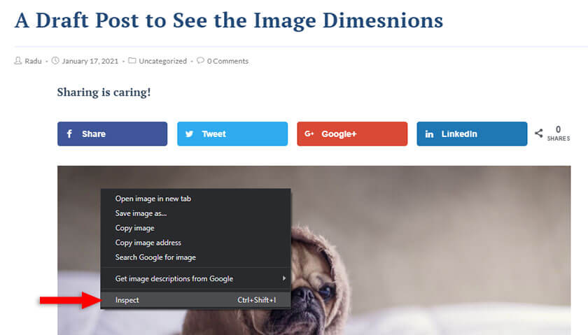
Step 2
The image along with the <img> tag from the source code should automatically be selected and highlighted in a blue overlay.
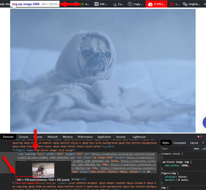
To see the image’s dimensions inside the container, look above it, in that tooltip box. You can also hover your mouse cursor over the <img> tag that’s highlighted in the Elements tab, and the dimensions will appear in another tooltip box. I recommend the latter option because it removes the decimals, giving you the exact number.
So, I’ve uploaded an image with a dimension of 1024 x 682 pixels, but as you can see from the screenshot, the image dimension in the container is 840 x 559.
This means that 840 is the largest size in width needed for my blog posts. Thus, I shouldn’t upload an image larger than that unless I have a good reason, like, when a part of the image is unclear and the user needs to click to enlarge the image.
Now, the height is automatically scaled based on the width, so you can leave it like that, or you could cut it to further reduce the file size.
What about image height?
Usually, you’ll need to find out the height when you want to have the same height and width for your images to maintain a nice symmetrical design.
One example is the blog posts’ featured images. Here’s an example from ReadyShip’s blog.
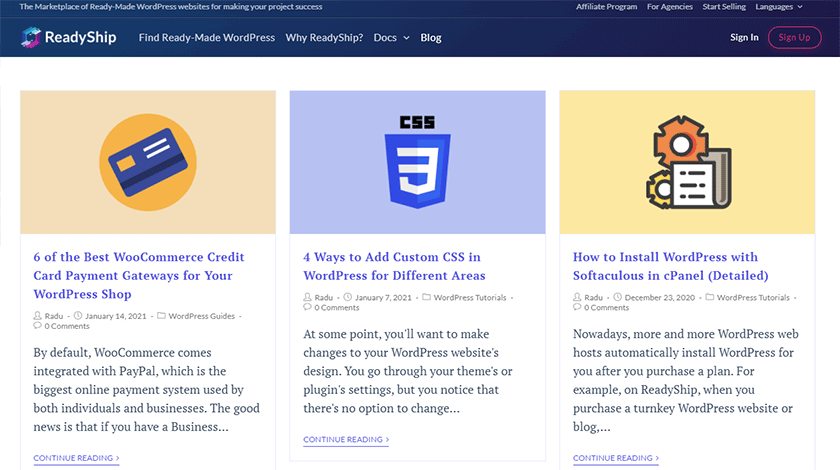
As you can see, they all have the same height here because I always upload images with a fixed height and width.
If I’d upload a featured image with a bigger or smaller height, the width would be the same but the height would be different, ruining the symmetry.
Some WordPress themes might force a fixed width and height for featured images, no matter what dimensions you use. But some don’t, and only adjust the height based on width.
Pay attention to the theme’s design
Some WordPress themes or plugins use an image from one place in several other places with different required dimensions.
For example, if your blog page has a slider that shows your recent posts using the posts’ featured images, then you’ll need to upload the dimensions required by the slider.
That’s because if the slider requires an image of 1200 pixels in width, but the featured images are 600 pixels in width, the slider might enlarge them to fit, blurring them.
Image dimensions for mobiles
You also need to think about mobile devices when you optimize images for WordPress, especially smartphones because the design will be displayed on a single column.
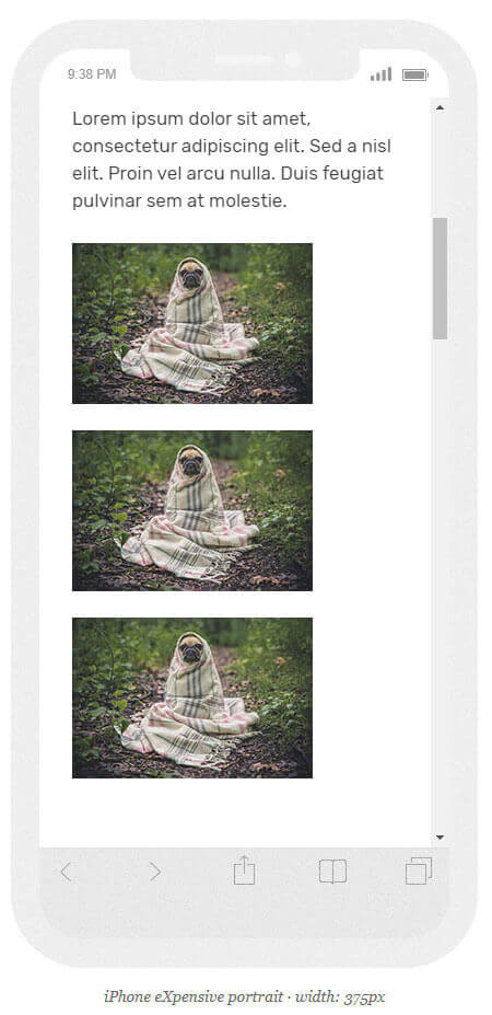
For example, if you use three images on three columns on a page, the dimensions would be quite small for each image.
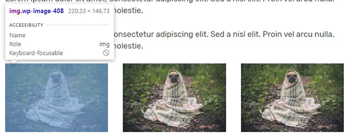
As you can see from the above example, each image has a dimension of 220 x 146 pixels. They look fine on a PC, but on a smartphone, they’ll look like this:
The images will look small when they’ll be laid out on a single column. It’s even worse if they’re not even centered.
So, in a case like this, you’ll have to make an exception and upload bigger images that will also look good on smartphones.
Because smartphones come in all shapes and sizes, you’ll have to pick a dimension that will cover most of them well. Then, the images will look like this on a smartphone:
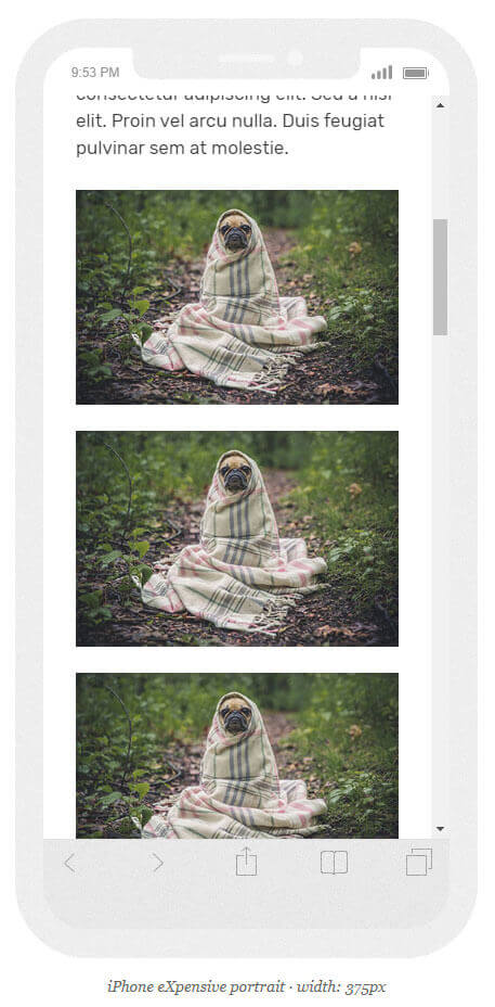
They look better now, don’t they?
Scale and Crop the Images
This doesn’t apply to SVGs!
After you’ve figured out the proper dimensions for your WordPress images, you need to scale them down based on the width that you need. You can also crop their height if necessary.
You’ll need a software or web tool for that, such as Photoshop, GIMP, or Paint 3D from Windows. Paint 3D comes with Windows by default, and it’s easy to use. I don’t know if Mac OS has something like that, but if it doesn’t, I recommend using GIMP, which is free and also supports WebP by default.
Compress the Images
Compressing the images can drastically reduce their file size. Graphic tools such as Photoshop or GIMP can do this when you export/save the images.
For JPEGs, things are more straightforward because most tools use a compression level between 0 and 100. You should usually choose 60 or 70 if the quality is visibly affected at 60.
For PNGs, the compression level depends on the tool. Some don’t have any level, some have a level between 0 and 100, and some have a level based on the number of colors, which is 0 to 256.
You can use an online image compression tool called Tiny PNG (it supports JPEGs too). I usually use this as well.
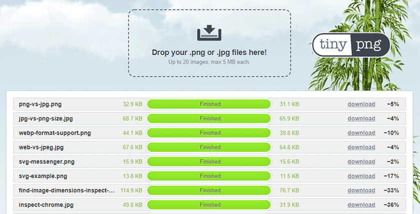
As you can see from the screenshot, you can take out a good portion of the file size with it. This counts a lot when using a ton of images as I am in this guide.
For WebP images, if you don’t use something like Photoshop or GIMP, you can compress them using a web tool like Ezgif.
So, always compress the images after you adjusted their dimensions and saved them in the proper format.
You Kind of Don’t Need Lazy Loading Anymore
The Lazy Loading feature loads and displays the images when the user scrolls down to their location, not prior. This was a pretty complicated feature handed by plugins.
But, in 2019, Google came out with the loading=”lazy” attribute for HTML, which you can add to the <img> tags, and the browsers handle the lazy loading for you. Unfortunately, not all major browsers. Safari slacks again.
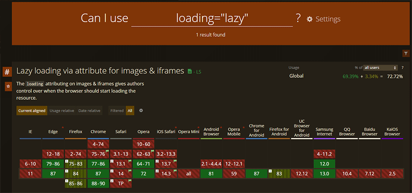
WordPress adds that attribute automatically starting with the 5.5 version. So, you don’t have to do anything unless you also want lazy loading to work in Safari as well. For that, you’ll need a plugin, such as Lazy Load.
Personally, I don’t use a plugin. I rather let the images load normally on Safari until they implement the native feature.
Looking to Buy or Sell WordPress Sites?
At ReadyShip, we offer an all-in-one WordPress solution for those looking to start a blog or site, as well as the opportunity for WordPress developers or professionals to sell their products!
Brief Summary on How to Optimize Images for WordPress
Here’s a quick list that puts thing into perspective:
- Find out the proper dimensions for your images.
- Scale them down and crop them if needed.
- Save them in the proper format.
- Compress them to further reduce the file size.
- Upload them in WordPress and check if they appear properly everywhere, including mobile devices.
- Use a Lazy Loading plugin only if you really want that feature to work on the Safari browser as well. I don’t recommend it, though.
Conclusion
As I mentioned in the beginning, optimizing images for WordPress can be a tedious process that’s hard to understand at first. But, you should definitely not skip it because it’s vital for your website’s performance, which in turn is vital for SEO, conversion, and user experience.
I hope that my guide was comprehensive, and helped you understand the image optimization process for WordPress.
If you need help, feel free to drop your questions in the comments.